For those who don’t believe that color choices matter, here’s something to ponder: the Australian government now requires that cigarettes be sold in “plain packaging” using Pantone 448C opaque couché, or, “the world’s ugliest color,” along with more warning labels. The goal is to prevent people from being misled (lighter colored packs may be assumed to contain less tar, etc.) and to make the purchase less appealing.
The decision to use the “drab, dark brown” color was made after three months of research and seven different studies in which Pantone 448C “was commonly described as ‘death’, ’dirty’, or ‘tar’ without any positive adjectives.” (Source: Brisbane Times) While this is certainly an interesting idea, are color choices really that powerful?
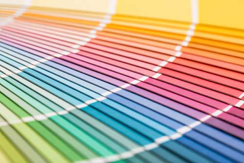
The gray area of color psychology
Associating color choices with emotions and traits is nothing new. The “Rose of Temperaments” was created in 1798 to attribute colors to Hippocrates’s “four humors” of personality. Color plays an important role in our everyday lives – from how we dress each morning to the food we choose to consume. It has been used symbolically in art and literature for centuries, but its direct power in advertising is open to question.
Relying on color psychology in marketing is controversial. There is little hard data to support its effectiveness, mainly because personal preference, experiences, upbringing, cultural differences, and context all play such a huge role in determining what each color means to a specific individual (Source: Entrepeneur.com).
For example, in Chinese culture, red is worn at funerals and weddings as well as to celebrate the New Year because it represents luck and prosperity. However, wearing red to a funeral in the Western world would cause more than a few sidelong glances, as dark colors like black are considered more appropriate for mourning. Because a specific color choices can have such different connotations across the world, it is impossible to predict universal response to it.
Why bother considering color choices at all?
Even though personal experience and cultural norms cause wide variations in how we perceive color choices, we are all nonetheless affected by it to a large degree. A study done at the University of Winnipeg found that people make up their minds about other people and products within 90 seconds of initial interaction and 62-90% of their opinion is based on only colors.
People prefer easily recognizable brands, so making the correct color choice is not only important for packaging, product, display, and website design, but also the company logo itself.
‘True colors” have to shine through!
No matter what our personal color preferences, the color still has to “feel right” for the consumer; it has to “fit” the product and the color will influence the perceived “personality” of the brand (Source: Journal of Sensory Studies). The study recorded in “Dimensions of Brand Personality” for the Journal of Marketing Research found that brand personality is divided into sincerity, excitement, competence, sophistication, and ruggedness.
In the consumer’s mind, color choices of the logo or product must match the personality that brand promotes or something will feel off. If the brand is trying to project an exciting, powerful attitude and uses a blue logo, it won’t matter that most people report blue as their favorite color because the cultural feeling that blue represents is often tranquility and peacefulness. Something feels not-right about the projected personality – it’s not about the customer’s favorite color, it’s about the right color choices for the company.
So whether you go in for color psychology or not, chances are that your color choices are impacting your customer’s perception of your brand. So here’s a golden opportunity to step out of the dark when it comes to the feelings that go with different colors.
The psychological effects of cool/warm, soft/bright colors
Just as a cursory glance at someone’s bookshelf gives you some insight into their interests, the color someone chooses for a room tells you at least how they will use the space. Cool colors (blue, green, purple) are perceived to be soothing and calm and warm colors (red, orange, yellow) are energetic and exciting.
Men generally prefer brighter colors and women prefer softer colors (Source: Kissmetrics). Thus, a boy’s playroom will likely have warm, bright colors but a woman’s home office may be on the cooler, or at least subtler, side for better concentration. These are important factors to consider when you are trying to appeal to a specific demographic.
One important factor to consider is the way you present product color choices to customers. People prefer “fancy” color names to generic ones across the board. For example, “mocha” is much more enticing than “brown” and “pine” is better than “dark green.” These names get more senses than just sight involved and feel more sophisticated and customized.
Common color associations
- Red—energy, war, danger, power, action, determination, passion, courage, and love
- Orange—joy, sunshine, communication, enthusiasm, fascination, and stimulation.
- Yellow—mind and intellect, optimism, and cheerfulness
- Green—balance, growth, self-reliance, possessiveness, safety, harmony, and fertility
- Blue—loyalty, integrity, conservatism, frigidity, wisdom, depth, and tranquility
- Purple—creativity, individualism, dignity, magic, independence, luxury, and nobility
- Pink—romance, love, friendship, and passiveness
- Brown—stability, masculinity, friendly, protection, comfort, and material wealth
- Gray—compromise, unemotional and detached
- Silver—fluidity, emotion, sensitivity, and mystery.
- Gold—triumph, prosperity, quality, prestige, value, elegance, and extravagance
- White—innocence, wholeness, and light
- Black—unknown, mysterious, elegant, and powerful
What’s been done?
While the emotions invoked by different colors are fairly wide-ranging, The Logo Company did create an infographic that shows what other companies have done by using certain colors in their logos:
When you are ready to make a statement with your color choices, Dazzle Printing is ready to help as a CMYK digital printing source that will leave you tickled pink and your competitors green with envy!


