It can be frustrating to deal with color inconsistency when switching from one process to another. Color matching is always difficult. One solution is to print only with spot inks, like Pantone, but that quickly becomes exorbitantly expensive. So when you are designing or printing on a budget and it’s time to choose between processes, it’s good to know that you can convert to a cheaper option in CMYK.
What’s the Difference?
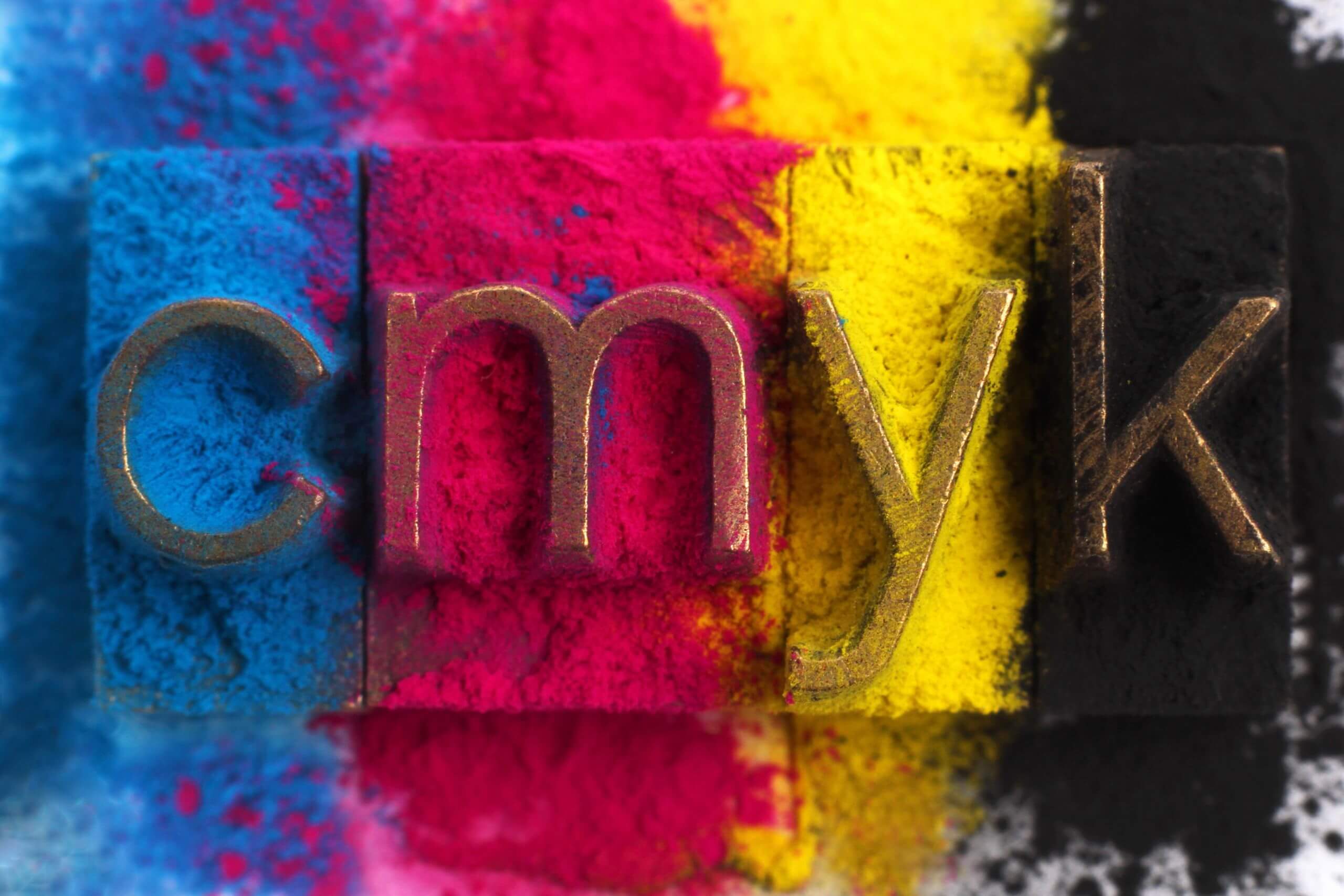
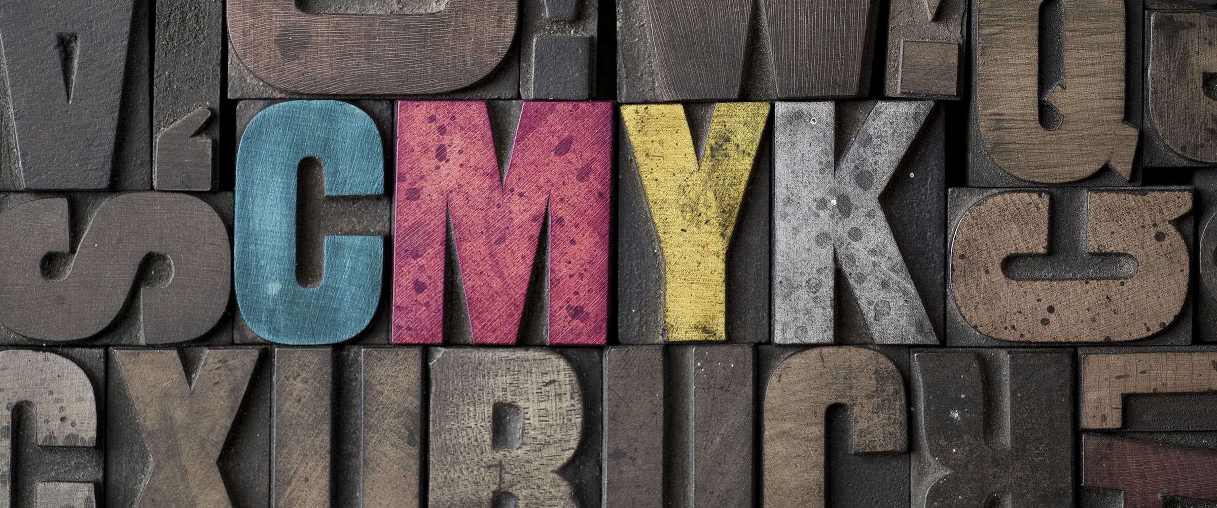
CMYK is a four-color option using Cyan, Magenta, Yellow, and Black in a process printing system. It is the most common and affordable color system and uses dots of color printed at different angles for high quality printed images.
Pantone is a spot color system with blended inks, mixed according to the Pantone color guide. Branded images and corporations that require perfect color matching regardless of whom is printing the image use Pantone colors. For example, the Pantone Color Institute recently announced the unveiling of a new color in collaboration with the estate of Prince: Love Symbol #2.
It was inspired by Prince’s purple Yamaha piano and is now the official color of his legacy’s brand. Because the brand is iconic and centered around the color, it is necessary that the shade be exactly right whenever it is used.
Pantone’s association with branding even extends to national flags: in January 2003, the Scottish Parliament debated a petition to have the blue in their flag be Pantone 300 Blue. Canada and South Korea both have specific Pantone colors in their flags and states like Texas also use Pantone colors. When the color is a vital part of an identity, to a country or corporation, Pantone colors are used.
But just in case you don’t have the resources of Coca-Cola or an entire state, you can convert the Pantone color you want to CMYK…with a little extra work.
Color Matching: How to Convert?
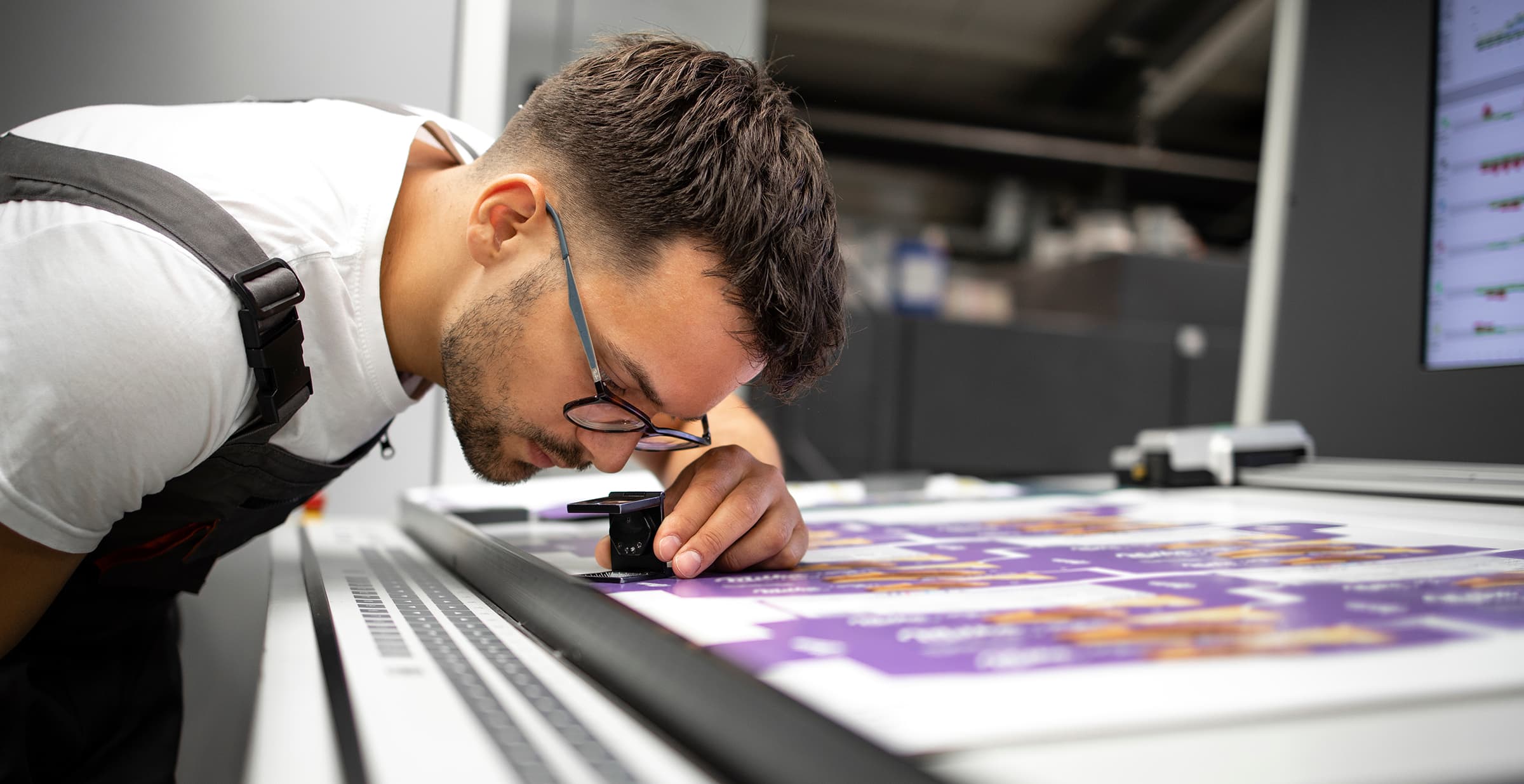
There is no 100% perfect color matching, but you can get pretty close. There are Pantone color bridge guides, but they cost $175.00. There are free options out there. For accuracy, it is recommended that you use paper charts or swatches. However, you can also use an online tool or the following options in your software (but remember to eye-check everything because shifts WILL occur):
- Using Photoshop: click on Image — Mode — CMYK color.
- Using Adobe Illustrator: Edit — Edit Colors — Convert to CMYK. Double-click on the Pantone color you want in the palette. Then go to Color Mode Menu — Next, go to Color Type Menu and click on Process, then click on OK. Repeat for each color you want to convert.
- Using InDesign: Window — Color and Swatches. Click on the arrow in the upper right corner, and then choose Select All Unused. Delete unused colors by clicking on the trash can icon. Double-click on the Pantone color you want in the palette. Go to the Color Mode Menu, choose CMYK, then go to the Color Type Menu and choose Process. Click OK. Repeat for each color you want to convert.
Remember, whether you are using paper charts, an online tool, or the software conversion tools, you will need to check the results yourself when color matching. CMYK has a limited range of colors, so it will not always product perfect color matching. Fortunately, for the sake of your budget, you can get pretty close!
If you are looking for printing services, be sure to check out Dazzle Printing‘s online pricing calculators.


