Are you looking to design a flyer to promote an event or business? If so, you want to make sure not to make common flyer design mistakes.
If you’re planning to design it yourself and have little or no prior experience, you might be unsure of exactly how to go about doing so. The design of a flyer can make all the difference when it comes to grabbing the attention of your intended audience.
Boring, dull, and wordy flyers will simply not warrant a second glance and are likely to be forgotten, if not completely ignored. Read on to find out some flyer design mistakes to avoid.
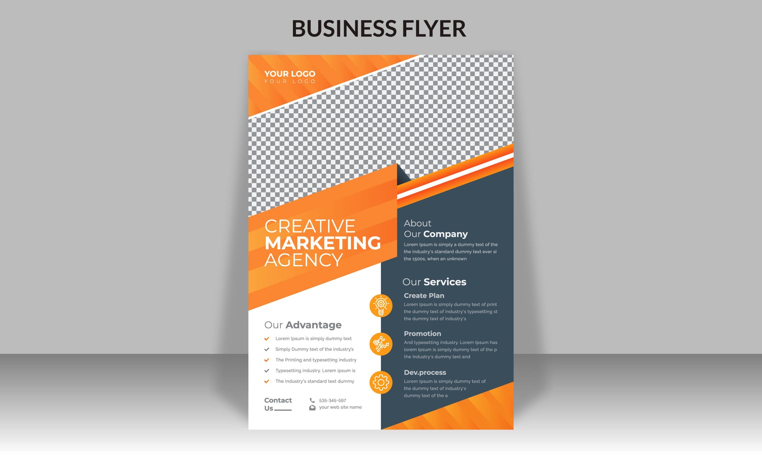
Flyer Design Mistakes — Too Many Words
While you might want to give your audience as much information as possible, a flyer that’s concentrated with words is much more likely to put a reader off. People who read flyers don’t specifically set time aside for it, and are likely to have a very short attention span.
As such, the design of your flyer must have some keywords that catch the reader’s attention, ensuring that the reader is focused on your message. Doing so will result in your campaign having a higher success rate.
Lack of Visuals
If you’re trying to sell a product or service, be sure to make use of visuals to allow readers to better visualize what they should expect, which avoids common flyer design mistakes. Studies have suggested that visual stimulation, by featuring something appealing, is one of the main triggers for people to engage. After all, few people would have the attention span to read through a flyer that has nothing but words on it.
Flyer Design Mistakes — Low Quality Images
Even after you have decided to incorporate images in your flyer, it is crucial that they be of high resolution and quality. People are much more likely to take your flyers seriously when the image is clear and concise as compared to blurry and irrelevant pictures. This helps them paint a picture in their minds and draw a positive response.
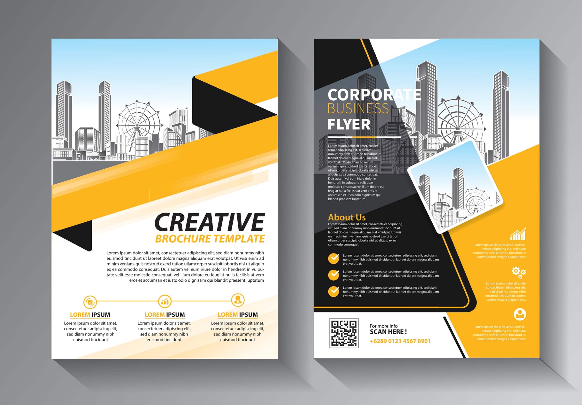
Overly Dull
The first task a flyer needs to fulfill is to grab the attention of the reader. As such, the headline you use is extremely important. Be sure that the headlines are made obvious through the right font and color adjustments, and that they are written in a way that makes the audience curious to discover more.
Apart from the choice of wording, you should also ensure that the colors of your flyer are not overly dull. Instead, you may consider using stronger colors or even your business’ colors for easy association.
Flyer Design Mistakes — Lack of Specifics
Your flyer needs to speak directly to the audience. As such, we recommend that you avoid using general terms and pronouns like “we” and “us”, instead, you should make the flyer speak to them, make your audience feel more involved through direct pronouns like “you” or “your”.
Consider who your target audience is, and ask what types of content they would be interested in. The contents should be directed at a call-to-action instead of general information that they would not be interested in.


