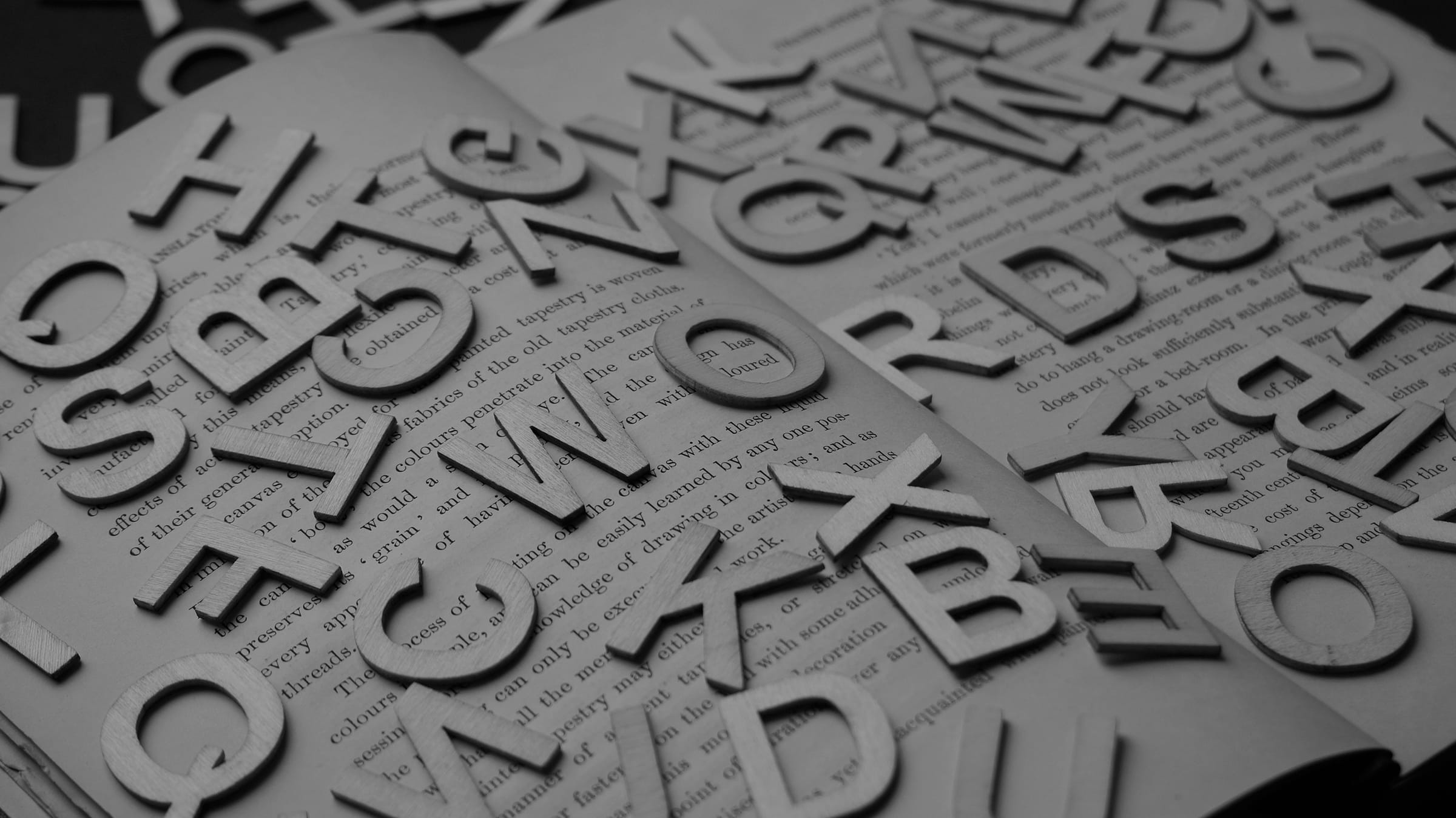
Before you print your book, spend some time on the book typesetting and other elements of the layout. Careful use of spacing, fonts, and margins will produce a book that looks beautiful and is easy to read. Follow these book typesetting rules to get the results you want.
Why Book Typesetting Matters
Many things go into finishing a book before it’s ready to be printed. Finishing the content, of course, is the first step. After that, layout, design, illustrations, and the cover art all need your attention.
Many authors don’t pay attention to book typesetting because they don’t realize how much of an impact it has on how a book looks. A book needs a well-balanced, carefully laid out interior to look its best.
Mistakes First-Time Writers Make with Book Typesetting
If a book’s author hasn’t paid attention to the typesetting, it’s obvious. Have you ever ordered a print-on-demand book and found that its pages had tight, tiny margins, uneven spacing, and long, unbroken blocks of text? Did weird paragraph breaks interrupt the flow of reading?
What happened? That writer was probably in a rush to get the book printed and didn’t want to spend time producing a book with an attractive, readable interior. Another possibility is that they were overwhelmed by the process of typesetting. Book typesetting requires patience and skill. It can be tedious, and some authors prefer to just skip it.
As a result, these authors produced uninviting books that readers don’t want to bother with. Don’t make the same mistake. These book typesetting rules will help you avoid turning off your readers.
Trim Size
The first step in laying out your book is choosing a trim size. The standard size for a printed book is 5.5 x 8.5 or 5 x 9. In some cases, however, you may need a wider or narrower size. If you’re self-publishing a book of poetry, for instance, you’ll want wide pages that don’t force you to break up your lines. Photography books, art books, and children’s books also use different page and trim sizes.
Fonts
Font choice is one of the most important choices you can make about your book’s design. When you pick up a printed piece of material, you make judgments about it based on the font it uses. Your mind decides whether it’s professional, elegant, readable, easy to understand, or amateurish.
Yes, a font can tell you all that. That’s why it’s important to pick the right one.
Research finds that for printed materials, serif fonts are the most readable. Most books, newspapers, and magazines use serif fonts for this purpose. There are many elegant serif fonts available. For online reading, both serif and sans serif fonts are readable options. Sans serif fonts are also an excellent choice for titles and headers.
Stay away from edgy or artistic fonts for the interior of your book. You can use an unconventional font for your book cover as part of the design. For the inside, stick to basic, readable fonts that most people recognize.
Special Characters
Whatever font you choose, make sure the special characters format properly. Special characters and font treatments should be clear. Make sure the font you choose has proper formatting for:
- Normal typeface
- Bold text
- Italic text
- Ellipses
- Quotation marks
- Trademarks
- Copyright marks
Book typesetting rules for quotations require that they appear as the traditional “curly” quotation marks and not the flat quotation marks.
Book typesetting rules for special characters:
- For ellipses, make sure you use the proper character rather than just three periods in a row.
- For em dashes, the same rules apply. Don’t just use two hyphens in a row. Use the actual character.
- Copyright and trademark designations also must have proper characters.
Where can you find these special characters? Most word processing programs have them. In Microsoft Word, choose “insert” and select the “symbols” list. This list has all the special characters mentioned above.
Margins
After choosing a font, getting the margins right may be the most important part of producing a good book interior. The margin size can have a significant impact on the way a book looks.
Each page on a book has three margins: the top, the bottom, and the outside. There is also an inside margin where the pages meet. This is known as the gutter.
Why you need margins and gutters
Margins exist for a simple reason. They give the reader space to hold the book without their fingers covering up the text.
They also allow space for the eye to rest. Spots of white space on every page keep the reader’s eyes from tiring and make it easy to move from page to page.
The gutter has a job, too. It makes sure the text doesn’t cross into the area where the pages are glued or stapled together.
Traditionally, the margins are about ½ inch wide, and the gutter is the widest space. It can be ¾ of an inch to 1 inch wide.
Columns
If your book has columns, follow this guide. Use a minimum of three lines to end or begin every column of text. This is one of those book typesetting rules that just works, so don’t ignore it.
Paragraphs
Separating paragraphs from each other is essential to readability. In some books, the first line of the first paragraph in a chapter is not indented, but the rest of the paragraphs are.
In others, a line separates each chapter. This is a good choice for dense, text-heavy books because it breaks up the text and makes reading easier. If your text is not that heavy, for instance, if you write with a lot of short paragraphs, stick with the indented style. Otherwise, your text will look like stripes on the page.
In some books, you may choose to insert a header at the top of every paragraph. This is more common for online books. In a printed book, it may look silly to have a header over every paragraph, but it might work for certain nonfiction books.
Always keep readability in mind. It should guide every book typesetting choice you make.
Widows and Orphans
When you talk about book typesetting rules, you can’t forget widows and orphans.
In printing terminology, a widow is the first line of a paragraph that appears on the last line of a page. An orphan is the last line of a paragraph that appears at the beginning of the next page.
What’s wrong with them? When you read, they interrupt the flow. They make you stop, which is never desirable. This is a subtle response, but it has powerful effects on a reader’s willingness to continue reading. Widows and orphans make a page look unbalanced. They are a clear sign that a book was not typeset correctly.
There are several ways to cut them from your pages.
- Margins: Sometimes, just changing the margin size can remove widows and orphans.
- Leading: Leading is the amount of space between the lines on a page. You can adjust leading for an entire book or a single page.
- Kerning: Kerning refers to the spaces between letters. Like leading, it can be adjusted to make text more readable.
- Rewrite the text: If all else fails, rewrite the text to remove widows and orphans.
Word Stacks
A word stack happens when the same word appears at the beginning or end of a line three times in a row. Word stacks look clunky, and they slow a reader’s eyes down. Get rid of them by adjusting the kerning, using a different font, or rewriting the text.
Should You Hire a Professional Typesetter?
Book typesetting can be a painstaking, tedious process, but it’s necessary if you want your book to look professional. If you don’t want to spend the time doing it, or if you’re struggling to get it done, consider hiring a professional.
A professional typesetter understands the book typesetting rules and how to employ them to produce a well-balanced, attractive book interior. A typesetter will handle the layout, font choice, spacing, trims, and everything else.
If you want a book that looks professionally designed, hiring a typesetter is a worthwhile investment. It will cost money, but it will save you time and headaches.
Get Expert Guidance and Printing
We hope you’ve enjoyed this guide to book typesetting. To make your finished book look its best, use professional printing from Dazzle Printing.


