Like a book cover, a magazine cover is designed to make an immediate impression on potential readers. Unlike a book, a magazine must consistently have great-looking covers that attract readers every month. How well does your magazine cover work for you? If your magazine cover design could use an upgrade, read on to learn easy tips and tricks that will work for any publication.
Why Magazine Cover Design Matters
A magazine cover is an invitation to readers. It provides a glimpse of what’s inside the issue with an appealing image and enticing headlines. People who read magazines enjoy spending time with their favorite publications, so you must convince them that your issue provides a lot of good reading.
Parts of a Magazine Cover
A major part of understanding magazine cover design is knowing the different parts of a cover. These work like puzzle pieces that come together to create a seamless design.
- Masthead: This is the title of the magazine; examples include Vanity Fair, Vogue, and National Geographic. The masthead is an important part of a magazine’s brand. It’s a trademark that is so recognizable, you don’t even need to read the full name to know what it is. That’s why a masthead must remain the same on every issue. It is the most consistent part of a magazine’s design and the one that readers will look for.
- Magazine deck: A line underneath the title that sums up what the magazine is about. Not all magazines have a deck. An example might be, “The magazine for women,” or “Inspiring the business world,” which is the deck of CEO Magazine.
- Dateline: The dateline on a magazine includes the issue number and publication date; for instance, “Volume 12, Issue 7, July 2023.” It usually appears in the upper right corner of the cover. Volume refers to the number of years the magazine has been in print (so Volume 12 means it’s in its 12th year) and the issue refers to the month or season of publication.
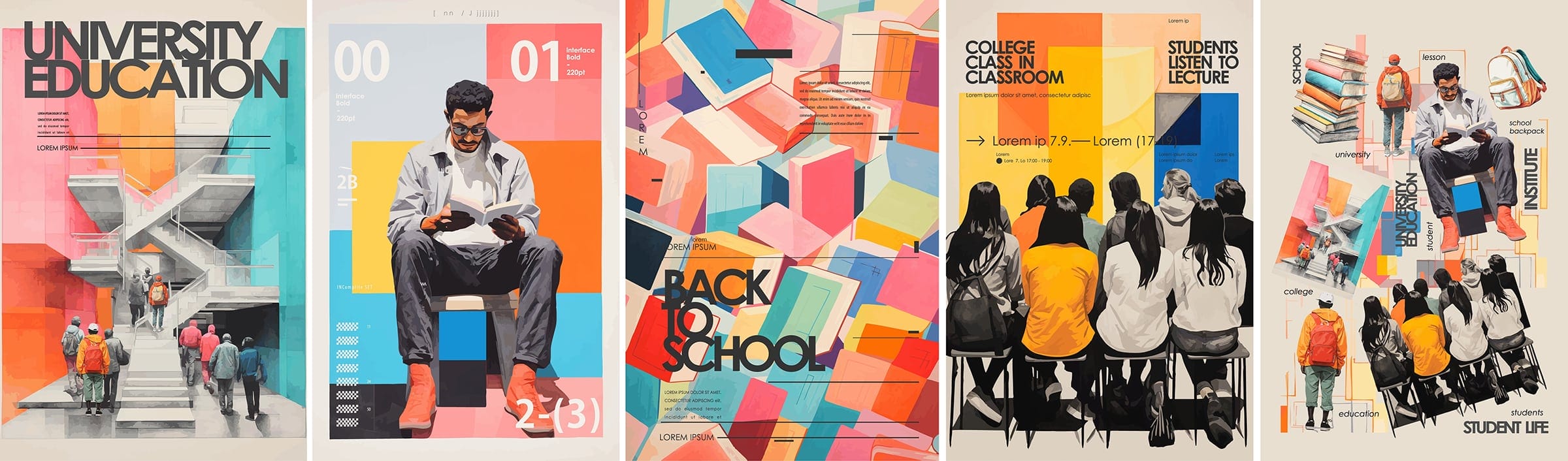
- Main image: The cover image of the issue is important. It might be a shot of a cover model, or someone interviewed in the magazine. It could be a beautifully designed room, an outdoor landscape shot, an abstract design, or anything else that’s visually arresting. Visually strong images without clutter work best. The main image is the first thing that most readers see, followed by the lead article line.
- Lead article line: The lead article line is placed prominently on the cover, usually in larger font than the rest of the headlines. It describes the main article the editors think will entice most readers. Some magazines put the lead article line in different fonts or colors to make it stand out. This is usually placed and designed in a way that it’s the first thing you see after the main image.
- Supporting coverlines: Coverlines tell the reader about other articles inside the issue apart from the main one. They must be concise and intriguing. Readers who aren’t interested in the main article will glance at the coverlines to see if there’s something else they want to read.
- Website link: Almost all magazines have an online edition where readers can get more information.
Color Is Crucial to Magazine Cover Design
When you design a cover for a book or magazine, color is very important. To get a sense of how important color is, glance over the magazines in your local store or library.
Some magazines opt for a clean, uncluttered look with only one or two neutral colors. This palette creates a striking, elegant background that works well for magazines that cover serious subjects, like finance or news analysis.
Others use bright, neon colors that appear to clash. You may think these schemes are over the top, but they instantly attract views and convey a message of fun and excitement. There is no denying that they are catchy and command attention.
Some publications combine colors and brightness for a balanced look. Readers can recognize their favorites by the style and colors they typically use for each issue.
Make the Main Image Pop
When you look at magazines, pay attention to the main images. Are they full-color photographs or black-and-white photo arrangements? Do the colors blend with the photos or stand out by clashing?
The choice and placement of your cover image is part of your magazine’s brand. Choose your layout and cover colors carefully because you will use them repeatedly. It’s important to create a recognizable color scheme your readers will look for when glancing over the titles on a shelf.
Use 3D Text to Create Movement
Using three-dimensional (3D) text is a common technique on magazine covers. Although the cover is flat, you can create visual interest by using 3D text. To do this, place the main image in such a way that part of the magazine’s masthead is covered. Allow images to wrap around the masthead and deck. Even if the name of the magazine is covered, readers will recognize your magazine because you’re still using the same basic cover format, colors, and fonts.
Use Mixed Fonts
When you study the magazine cover design of any popular publication, you’ll notice the use of mixed fonts to call attention to the main story and supporting coverlines. These lines might be in bold, italic, all capitals, surrounded by fluorescent highlighting, placed in a block of text, or surrounded by a circle.
When you glance at the magazine cover, these colorful fonts stand out. It’s important to call attention to your cover article and other coverlines, so feel free to get as creative as possible with this part of your design.
Keep Your Branding Consistent
Once you’ve decided on a cover style, use it for every issue. You can vary the covers with different colors, font styles, cover images, and other elements of design, but the basic format should be the same from issue to issue. Your masthead and deck should not change.
Consistency builds brand familiarity, and that familiarity will help your magazine stand out. Most people can recognize well-known publications like National Geographic, Time, Rolling Stone, Cosmopolitan, and People without even reading their titles. These magazines have spent decades using the same basic layout and design, and their cover looks are instantly recognizable.
Break the Mold
If you’re stuck for design ideas when creating your magazine cover, get some inspiration by studying how other designers have done it. There are hundreds of magazines published every month, and they all have their own unique style.
At the Canva design site, the editors have rounded up a collection of magazine issues. Each stands out for its intriguing magazine cover design. Consider using some of these techniques when designing your cover.
Print Your Magazine Professionally
Don’t spend time creating the perfect magazine cover design—only to have it fall apart because you’re relying on low-quality printing. Professional printing makes a huge difference when you create a magazine. If you want those colors and coverlines to pop, you’ll need high-quality paper and an experienced printing team.
Summing It Up
To create an eye-catching magazine cover, you must have:
- Strong central image
- Eye-catching headline and coverlines
- Mixed fonts
- Attractive color scheme
- Use of 3D text and other effects
- Balanced layout
- Consistent branding
Punch Up Your Magazine Design
If you publish a magazine, your cover design is a key selling point. An attractive cover will grab readers’ interest, and properly designed coverlines will make them eager to open the magazine and start reading. When it’s time to professionally print your magazine, contact the experts at Dazzle Printing.


