Writing a book and getting it into the hands of readers is an amazing feat with all of the time and effort that goes into just the writing process alone. But self-published authors who forgo the traditional publishing route need to know what to do to make a professional self published book.
While publishing houses have in-house designers that work on books that a company is promoting, an author who self-publishes has to figure out a lot of design basics on their own for a professional self published book. Readers can often tell at a glance whether book is professionally published or not by the way the book looks on the outside as well as by taking a cursory look at the insides – without even reading a word.
No author wants their book to be skipped over by a potential reader just because of the way the book was designed, so let’s look at the five areas of book design that authors should focus on to ensure their work is thought of as a professional self published book.
Why Does a Professional Self Published Book Matter?
We’ve all heard the adage don’t judge a book by its cover. But the truth is that readers do make judgments based on how a book looks. The trick for any author is to craft an outside book design – the cover, spine, and back cover – that draws the reader’s interest without the book appearing too different from the rest of the books on the shelf.
Books with a mismatched look for their genre, a book spine that is hard to read, or a cover design that is confusing can tip the scales away from your book for a reader considering picking up a copy to peruse.
If a reader makes it past the outside of your book, readers may skim a few pages to see how they feel about the book. As an author, you hope that a reader will become engrossed in the words on the page and sink their teeth into the story.
But the truth is that when something feels off about the way a book looks, like the page numbers are in the wrong place or the lines are too close together to be read easily, a reader may not even give the content of the book a chance. A professional self published book that falls in line with traditional book printing standards will have a more professional appearance, and as a result, will make your book more likely to be picked up by potential readers than a book that does not.
5 Areas to Get Right on Your Professional Self Published Book
Learning the best way to design your book’s appearance is a big part of self-publishing. But authors who get it right will be rewarded with a professional self published book that attracts readers and looks great on the bookshelf next to books that have been produced by big publishing houses.
And designing these five areas well will ensure that your professional self published book will look professionally made and potentially get your book into the hands of more readers.
The First Thing Readers See: The Spine
Scanning bookshelves in the library or at a retail seller, the first view of most books is of the spine. The dimensions of the spine can be tricky to compute for self-publishers without any printing experience so the title, author name, and other spine details can appear ill-proportioned, especially when color combinations make text hard to decipher or when the title is misplaced.
How to Fix It:
- Carefully calculate the exact width and height of your book’s spine relative to the length of your book. Do this last so that any changes to the book’s length during the editing process won’t change the dimensions you have to work with.
- Consider adding a logo to the very bottom of your spine. Professionally published books often sport a company brand like a penguin or a house, so adding in your own small, branded icon will help your book to blend in while also increasing your own personal brand awareness to readers.
- Make sure your book’s title faces the right way on the spine by starting on the left side of the spine, so it is read from the top down.
- Use an easy-to-read font for the title and your name in a high-contrast color combination.
Cover Art and Design
Professional book design will integrate expert design elements on the cover as well as use the back cover as a marketing tool for the author’s work. To create a professional self published book, authors should be sure their design follows genre conventions and meets reader expectations about what the book should look like from the outside in.
How to Fix It:
- Include a blurb from another author or someone key in your book’s genre that will excite potential readers.
- Put the ISBN number and bar code on the back of the book.
- Survey other popular books in your genre to see what famous authors have included on their front and back covers.
- Work with a cover design expert to help you create the best possible cover for your book.
Cover Copy
Next to its design, the cover’s copy is critical to making a professional self published book. The copy formatting lets a reader know what to expect inside the book’s pages, so presenting a book with a professional copy appearance will encourage readers to pick up your book.
How to Fix It:
- Consider the back of your book as a marketing tool. Use the space to deliver meaningful copy that will engage readers in your story, characters, and world.
- Match industry standards by justifying both margins on the back cover copy, using colors with high readability, placing copy to match other books in your genre, and leaving plenty of visual white space.
- Use the back of the book to educate readers about other books you have written, other books in the series, or other valuable information about you, your brand, or the book itself.
Front Matter
Once a potential reader opens your book, they see what the industry has coined “Front Matter. These first five pages are standard inclusions in a professional self published book and all self-published books should correctly use them in this order to match industry standards and reader expectations.
Half Title Page: A blank spacer page should come after this page.
Full Title Page: Another blank page usually follows this page as well.
Copyright Page: This required page can be created by any author or publisher.
Dedication Page: While not required, this page is typical of traditionally published books.
Table of Contents: Readers rely on an accurate listing of chapters and page numbers found here.
Formatting
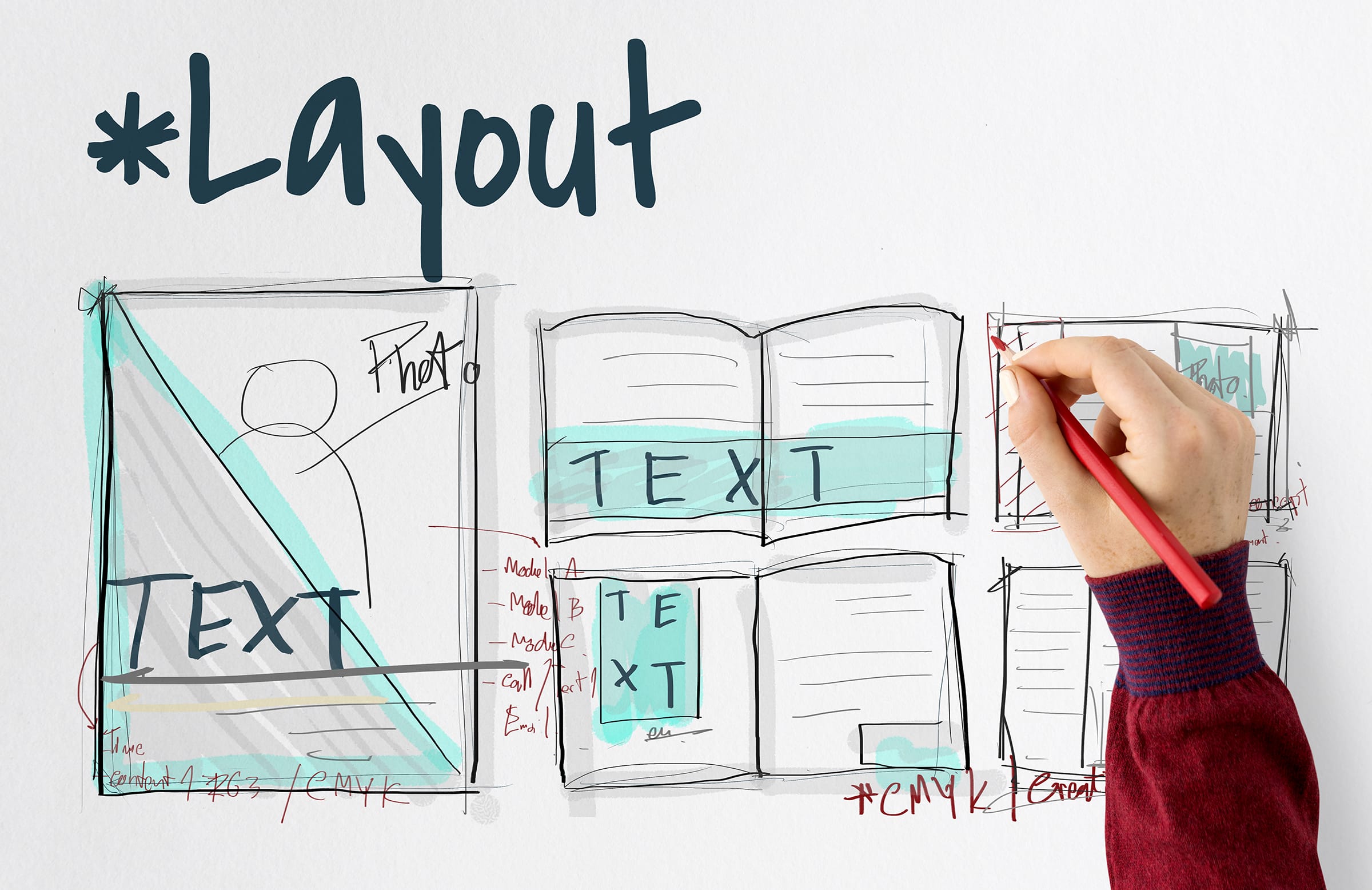
Once your book is opened, readers have common expectations about how a book should look and feel. Authors can format their books using industry standards, but still add their own twist to personalize the way their book looks without making readers wonder if the book was professionally published or not.
- Headers: Centered at the top of every page, an author should include either the book title, chapter title, the book title, or the author’s name or a combination of these.
- Line Spacing: Lines should be spaced enough for readers to easily read the text, but large gaps between lines are a dead giveaway of a self-published book. Avoid large line spacing to also save money on printing extra pages that result from formatting lines with a too-large gap.
- Margins: Text should be right and left justified to create a clean, straight margin on all sides.
- Orphans and Widows: Rework the bottom margin of an individual page to avoid leaving a single word on a line by itself (called a widow in the printing industry) or a singular word that begins a new page (called an orphan).
- Page Numbers: Every book should have page numbers on the outside margin of a page, but authors can choose the top or the bottom of the page. Make sure odd page numbers appear on the right hand page and even page numbers appear on the left hand page.
Checking Your Book: How to Know If Have a Professional Self Published Book
Ensuring you have a professional self published book can help you get more readers to pick up your book and even more to decide to read it. But once you have completed the drafting process, it’s a good idea to check your book first.
A good way to do this is to work with a printing company like Dazzle Printing that provides a physical press proof copy of your professional self published book for a small additional charge. This means that you will get to see a fully printed copy of your professional self published book exactly the way that it will look when it is printed in your order.
You can check your final draft against other books and industry standards and make tweaks before your book goes to print. You don’t want your efforts to design a professional self published book to miss the mark so make sure that you give it a thorough look before sending off your final let’s go to print! note to your printing company.


