How much do you know about book fonts? If you’re printing your book, one of the choices you’ll have to make is what font to use for the inside pages. Knowing which book fonts are available and which are right for your work is a key part of publishing and design. What font choice is best for your book? Let’s find out.
Understanding Book Fonts
Book fonts are styles of letters, numbers, and symbols. Choosing the right font is important for any creative project. With the right book fonts, you can create a book that looks crisp and attractive.
The main thing a book should be is readable. Clean, uncluttered book fonts are the best choice for your self-published book. They print well and are the type most readers are used to seeing.
What Are Serif Book Fonts?
If you’ve learned anything about book fonts, you probably know that there are two types: serif and sans serif. What does that word mean?
When early printers were setting type, they created small strokes as attachments to the ends of each letter or symbol. This small line or stroke became known as a serif, but the origin of the word is not clear. Some historians think it comes from the Greek word for “projection,” while others say it comes from the early Dutch word “schmeer,” which means line or dash.
The term “sans” is from the French word meaning “without.” A sans serif typeface does not have these little projections. Within the serif and sans serif fonts, there are many variations.
Which Book Fonts Are the Most Readable?
Why did printers create those little projections? They make the text easier to read.
When you read serif lettering, the dashes on the ends of each word work like little visual hooks. They make it easier to read because your eyes are moving from one hook to the next. Your eye bounces easily from one word to the next, and that makes the text fast and easy to read.
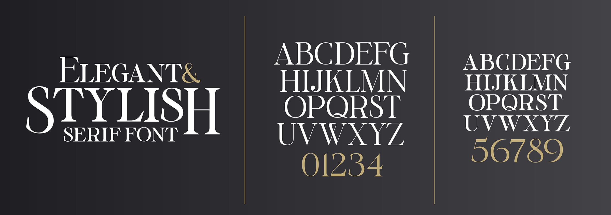
Serif Book Fonts Are a Classic Choice
Serif fonts work well in any printed document. That’s why they are the most popular choice for a wide variety of printed and audiovisual materials, including:
- Newspapers
- Magazines
- Books
- Brochures
- Manuals
- Movie credits
- Instructional films
- Warning posters
- Legal documents
Serif fonts are classics that have been around for a long time. Some were developed centuries ago. They are still popular because of their clean look and their versatility. These letters always look crisp and clear, even when they are in large font sizes or bold typeface.
What are some examples of serif fonts? You are probably familiar with the best-known serif fonts. They are the default fonts for many online text editors.
The best serif book fonts include:
- Argesta
- Bell MT
- Bookman Old Style
- Caslon
- Garamond
- Georgia
- Lora
- Minion Pro
- Palatino
- Sabon
Any of these would be the right font choice for your book.
What about the size? Most books use 12-point or 14-point fonts. This is a popular size that is legible to most people. Don’t try to save space by printing a tiny font size that will be frustrating to read.
Sans Serif Book Fonts Have Their Place
San serif fonts are simple lettering styles with no hooks or lines. Their smooth lines create a casual, relaxed look. Using a sans serif font as an alternative font will make your book easier to read and add an attractive design element.
Serif fonts were introduced to the publishing world in the late 1800s and were very popular in the 1920s and 30s. Their clean, rounded lines and simple shapes went well with the design esthetics of those decades.
Sans serif fonts are attractive. These fonts look especially good in larger sizes, which means they work well in posters and brochures. They are excellent for:
- Book titles
- Headlines
- Pull quotes
Some people have successfully used sans serif fonts as their website typefaces. For books, it’s better to stick to a serif font.
What are some examples of this font type? The following sans serif book fonts are all excellent choices for specific elements of your book:
- Arial
- Gotham
- Franklin Gothic
- Futura
- Helvetica
- News Gothic
You may have seen blog posts, pamphlets, and other materials written entirely in sans serif fonts. They can work in small doses online, but a printed book needs a crisp, readable serif text.
Use Two Book Fonts
Get a readable, attractive design by using one font for the book text and another for headlines and pull quotes. Maintain consistency by using the same font size and capitalization in each headline. Use your serif font for the title page, copyright page, and dedication.
Special Effects for Book Fonts
Every font can be changed to a bold, italic, or all capital (“all caps”) style.
Bold: You can use bold fonts in your headlines, chapter titles, and book title. It’s highly unlikely you would use it in the text, except to highlight specific words.
Italic: Italic fonts are often used in publishing to denote book or movie titles. They can be used to emphasize certain words to clarify your meaning, for instance, in the phrase, “That’s what you think.” Italics are also used to denote foreign words.
All Caps: Writing in all caps is considered the online equivalent of shouting. Are all caps all right in a printed book? You may occasionally use them to create word sounds, for instance, “WHAM!” or “POP!” This use should be rare, however. Don’t write entire sentences in all capitals.
Book Fonts You Shouldn’t Use
There are hundreds of fonts available to you. As a self-published author, you can choose every element of your book. That said, your readers won’t take you seriously if you use an unconventional font that looks weird or is hard to read. Stay away from these odd font styles, including:
- Algerian
- Baguet Script
- Broadway
- Comic Sans
- Freestyle Script
- Rage Italic
Is a Font the Same as a Typeface?
Some people mix up the terms “typeface” and “font.” Although both words refer to styles of letters, they are not different words for the same thing.
A typeface is a set of design features for letters and other characters. A font is a variation in the weight and size of a typeface. For instance, Helvetica is a typeface, and Helvetica Bold is a font that is a variation of the Helvetica typeface.
This distinction isn’t really important, especially in these days of digital pre-press production. In earlier times, it was important to know both the font and the typeface because the printer used a typeface to set the presses.
Three Simple Rules for Book Fonts
Here are your simple rules for book font choices:
- Use a serif text for your interior pages, copyright page, title page, and other elements of your book.
- Use sans serif text for chapter titles, headlines, pull quotes, and subheadings.
- Two fonts give your book a professionally designed look, but more than two may look messy and muddled.
Expert Printing Makes the Difference
Once you’ve made your font choice, the next step is getting your book expertly printed. Professional printing makes your chosen font look its best. If you’d like to check out how much it would cost to have Dazzle Printing print your books, check out our online pricing calculators.


