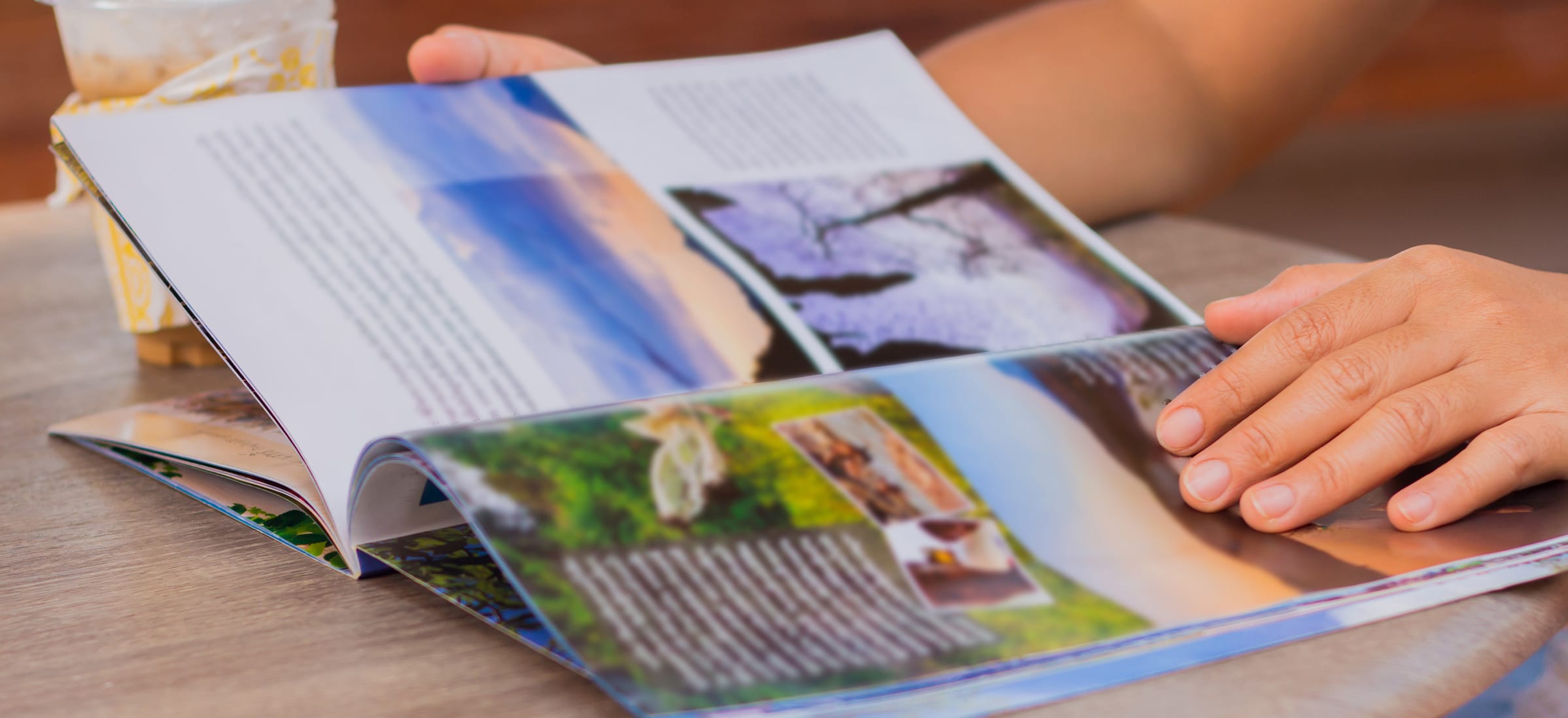
Turning the page of a magazine can reveal an almost endless variety of ways the author presents content from one issue to the next. From in-depth storytelling to stunning photography to listicles boasting the top ten must-haves for the upcoming season, each issue of a publication should have readers anticipating exciting new content using compelling visuals along with meaningful content.
And authors are challenged to design magazine spreads that not only look great but also provide interesting content that readers will look forward to with every issue. Writers who are creating magazine visuals that work follow a few design principles that you can use in your publication to wow your readers and keep them coming back for every issue to help you build readership and increase your magazine’s circulation.
Using Design Principles in Magazine Spreads
By their very nature, magazines are a visual medium. Of course, authors that write, design, and self-publish magazines provide plenty of substantial topic-specific content for readers to enjoy. But the truth about magazines is that readers connect with the aesthetics of a magazine sometimes just as much as the content.
Every publication builds its look and feel that represents not only the author’s vision for the magazine but also one that speaks to the genre and general topics the publication focuses on.
And regardless of whether the intended audience for a magazine is young or old or the content in the magazine is trendy or timeless, the way the content is presented should be guided by basic design principles to make the magazine spreads visually appealing to readers.
When creating magazine spreads that balance color, text, graphics, and white space, magazine authors can tap into the design secrets long followed by creatives like designers and artists.
Big Quotes in Magazine Spreads
Eye-catching magazine spreads highlight a quote by placing it in a large font. Swapping out the basic font used for content for one that evokes the right emotion while still being highly readable further puts the focus on the big quote and readers will be drawn to the large text in the same way they view a gorgeous picture.
Using big quotes on magazine spreads provides readers with an unusual focal point to enjoy instead of another picture or graphic element on the page. The use of an oversized quote demonstrates the hierarchy of the page clearly to the reader and provides them with an instant visual of importance with this unexpected text anchor on the magazine spreads.
Color Blocking in Magazine Spreads
Another way to give depth and cohesiveness when creating magazine spreads is to use the design principle of color blocking. Since colors have a direct correlation to how we feel, magazine authors often choose color palettes to subtly evoke emotion or provide a visual connection to the tone of their publication.
Using one dominant color, chosen for its connection to the content as well as for the feelings the color brings out, across two pages will present a united visual on a magazine spread. Color blocking can be accomplished by using one photograph across both pages weighted heavily with one hue or by placing two different photos or other graphic elements side by side, taking up a majority of the two pages that utilize the same or almost the same color.
These large splashes of color will add a punch of visual interest while also becoming a backdrop for smaller text on the page spread at the same time. The monotoned color palette created with color blocking makes the small details of the pictures visually pop out on the page instead of becoming lost in a picture with minimal color variation.
Limit Color
Almost counterintuitive to creating magazine spreads, authors can use whitespace to highlight key elements as a focusing technique. Instead of filling every page with splashes of color or brightly hued text, the negative space that white contributes to a magazine spread can be a surprising and therefore very effective design element to use.
Magazine creators can sprinkle in the use of limited color by using calculated white space and they can also limit color by restraining the color scheme to reflect the tone of the content on the spread. For serious, sad, or heart-wrenching stories, authors could switch to an austere black and white to create a stark contrast. Whereas other magazine content rich with vibrant colors will reflect a lighter mood or more cheerful content, limited color choices give a visual cue to readers about the upcoming content’s tone.
Maximalism in Magazine Spreads
Just like the popular quote says, go big or go home to reap the benefits of a maximalist design principle on a two-page magazine spread. The concept of maximalist design integrates big, bold colors with large, memorable fonts on both titles and text content. Oversizing the spread’s pages usually pairs best with a whole magazine approach, however, as mixing in this cheeky design element with an otherwise subdued magazine feel can be jarring.
Minimalism
The quieter sibling to maximalism, minimalism is far better known and recognizable. But creating a two-page spread with extra whitespace, smaller and less bold text and fewer graphic elements is much easier to mix into a magazine with a less-defined feel.
Magazines tend to lean in one direction as a whole, however, and generally promote a minimalistic look from cover to cover or use maximalism as an overall philosophy throughout the whole publication. If you love the clean, spare look of minimalism, it is easier to pull off as a one-time spread concept so don’t be afraid to add it to your magazine’s pages to add interest to a two-page spread.
Thinking Up with Vertical Alignment
While traditional magazine structure runs horizontally, one way to capture your reader’s attention and their instant engagement is through the use of vertical alignment. Readers will have to go the extra step to physically turn the publication to view the spread contents when it is configured up and down rather than side to side.
But if you are looking for an unexpected twist for your next two-page magazine spread, vertical content can provide a new and interesting experience for your readers. In addition to switching up the format for each page to allow for a much wider format, the gutter or inside margin that sinks into the binding will be located in a different place on your spread pages and may allow you room to present fresh content pages not accessible with horizontal spreads that your readers will love.
Weighting
When two-page magazine spreads contain a single photograph or graphic, instead of using the width of both pages, give one side of the spread more weight by creating an uneven spread. By filling one page completely (or almost) but only using half or less of the other page, this design concept visually weighs one side of the spread more heavily by simply putting less on one page.
Especially effective with one large photo, the unweighted side works well in conjunction with a big quote or a minimalistic approach to text and heading in the whitespace provided.
Creating Magazine Spreads for Your Publication
Keep your magazine readers interested and excited about upcoming issues as you plan, design, and print each one with magazine spreads that not only reflect the concept of your magazine but also the tone and feel that you want to project.
Mixing up the styles of spreads you use is easy to do by trying out a spread that follows one of these tried-and-true design basics. And working with a trusted printing company like Dazzle Printing can help you make the most of your next magazine, so you can continue to build your magazine’s circulation and gain fans with a beautifully printed publication. Let the printing experts help you bring out the best in your next publication.


